From WordPress administration you can find the “Wp 3D Thingviewer”” configuration page.
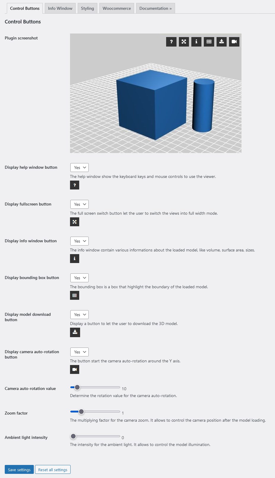
Control Buttons
In this section you can manage the button displayed into the thingviewer.
Here are the explanation for the configuration parameters:
Display help window button:
The help window show the mouse controls to use the viewer.
Display fullscreen button:
The full screen switch button let the user to switch the views into full width mode.
Display bounding box button:
The bounding box is a box that highlight the boundary of the loaded model.
Display info button:
It manage the button for displaying the info window.
The info window contain various informations about the loaded model, like volume, surface area, sizes.
Here is an example of an info window.
ATTENTIONYou can change the information displayed into the info window into the "Info Window" configuration page.
Display camera auto-rotation button:
The button start the camera auto-rotation around the Y axis.
Camera auto-rotation value:
This is the speed for the camera rotation in the auto-rotation mode.
An higher value will rotate the camera quicker.
Zoom factor:
It manage the starting zoom factory after the 3d model is loaded.
And higher value it pull the camera near the object.
Ambient light intensity:
This parameter allows to adjust the ambient light for the thingviewer.
If you want to illuminate mode your model you can set an higher value.
Info Window
In this section you can customize the appearance of the info window.
Display model filename: Display the filename of the loaded model into the info window.
Display model file size: Display the file size of the loaded model into the info window.
Display triangles number: Display the number of the triangles of the loaded model info the info window.
Display surface area: Display the surface area of the loaded model into the infor window.
Display volume: Display the volume of the loaded model into the info window.
Display bounding box size: Display the bounding box sizes of the loaded model.
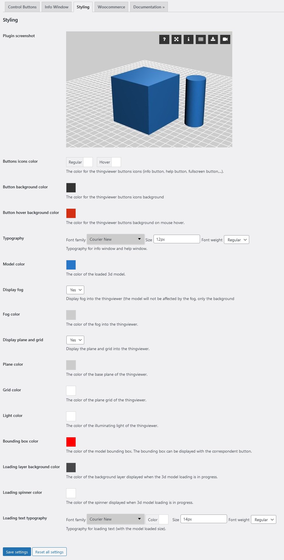
Styling
In this section you can customize the colors of the various elements of the thingviewer.
Buttons icons color: The color for the thingviewer buttons icons (info button, help button, fullscreen button,…).
Button background color: The color for the thingviewer buttons icons background
Button hover background color: The color for the thingviewer buttons background on mouse hover.
Model color: The color of the loaded 3d model.
Fog color: The color of the fog into the thingviewer.
Plane color: The color of the base plane of the thingviewer.
Grid color: The color of the plane grid of the thingviewer.
Light color: The color of the illuminatig light of the thingviewer.
Bounding box color: The color of the model bounding box. The bounding box can be displayed with the correspondent button (see Control Button section).
Loading layer background color: The color of the background layed displayed when the 3d model loading is in progress.
Loading spinnder color: The color of the spinner icon displayed when the 3d model loading is in progress.
Loading text typography: Typography for loading text (whit the model loaded size).
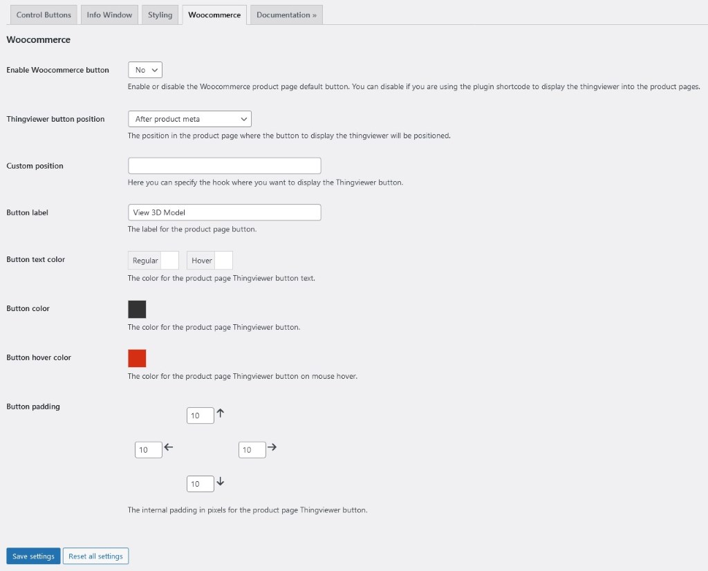
WooCommerce
In this section you can customize the WooCommerce settings of the thingviewer.
Enable Woocommerce button: If “YES” display the thingviewer button automatically on the product page. You can specifiy a model for any product (see the Woocommmerce Integration for more information). You can set this option to “NO” to disable the thingviewer button on product page.
Thingviewer button position: The position of the thingviewer button. Theese are the standard Woocommerce hooks where the button can be displayed.
Custom position: If you want to display the button in a customized position you can write here the hook name.
Button label: The label for the thingviewer button.
Button text color: The color of the thingviewer button text.
Button color: The color of the thingviewer button in “normal” state.
Button hover color: The color of the thingviewer button in “mouse hover” state.
Button padding: Here you can customize the button padding for the woocommerce thingviewer button.
Was this helpful?
0 /
0
Woocommmerce integration – Accolore Documentation
[…] More info can be found on the dedicated page. […]


[…] More info can be found on the dedicated page. […]